- This topic has 17 replies, 11 voices, and was last updated 8 years, 11 months ago by
 Russell Phillips.
-
AuthorPosts
-
15/05/2015 at 13:07 #24342
 Russell PhillipsParticipant
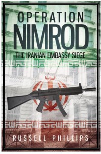
My next book is almost ready but I need help choosing a cover design. I can’t put numbers under the pictures, unfortunately, but I suggest we refer to them as numbers 1 to 6 for ease of reference. Clicking on an image will take you to a larger version.
Without MP5 (numbers 1, 2, 3):


With MP5: (numbers 4, 5, 6):


So, which one do you prefer? If you could also add why, that would be really helpful. If I choose one with an MP5, I might go for a different MP5 photo with a telescopic stock – I’m not sure what the attachment on the muzzle is, and I’ve certainly not seen it in photos from the siege.
Russell
[poll question=’Which cover design do you prefer?’ answers=’1,2,3,4,5,6′]
15/05/2015 at 13:17 #24345 MikeKeymaster
6, but it was tight between 5 and 6.
I think the text needs to be bold and stand out as it does in 6, but it also seems a bit washed out.
The text seemed a bit lost or distant in 5, the green being too strong.
Gun and symbol essential for me.I would like to see 5.5 which is not quite as faded as 6.
Or maybe 6 with a bit bolder blockier text..Hmmm maybe just change the border:
EDIT: yes that would be my choice I think were it an option.
 15/05/2015 at 13:22 #24346Russell PhillipsParticipant
I’m really torn about the flag with the symbol. On the one hand, I like it. On the other hand, that flag wasn’t adopted until July 29, a couple of months after the siege. Just to complicate things, before then Iran had a state flag and a national flag. I’m not sure which one would have been used at the embassy.
Edited to Add: Wikipedia’s “Flag of Iran” page: http://en.wikipedia.org/wiki/Flag_of_Iran
15/05/2015 at 13:24 #24348MikeKeymasterIf it looks good then use it, you can put a disclaimer inside the book.
After all, despite the saying, people do judge a book by its cover and if you think it looks best…
15/05/2015 at 13:35 #24353Russell PhillipsParticipantIf it looks good then use it, you can put a disclaimer inside the book. After all, despite the saying, people do judge a book by its cover and if you think it looks best…
I completely agree that people judge books by the covers. The trouble is, they can also be very pedantic about them 🙂
Usually, when I get the designs back from my cover designer, I know which one I want (sometimes with some tweaks). This time, though, I’m really not sure 🙁
15/05/2015 at 14:07 #24355 General SladeParticipant
To be honest I think all the designs are a bit hard on the eye. I wouldn’t have the photograph showing through into the sections of text, I would use solid blocks of colour instead, and personally I would use brighter colours rather than these rather muddy tones. However, I think your real problem is that the photograph is a bit boring (it could almost have come from the window of an upmarket London estate agent).
I assume that you can’t use pictures of the siege itself for copyright reasons but rather than use the current image I think you would be better with no photograph and just the image of the gun.
15/05/2015 at 14:37 #24356 willzParticipant
I agree with general Slade all the covers are hard on the eye, personally I would not have the gun on the front I would have a British S6 respirator more iconic and that is what sticks in my mind from watching the siege live.
15/05/2015 at 14:41 #24359 DMParticipant
5 or 6 for me 🙂
15/05/2015 at 14:48 #24362General SladeParticipantWilliam Harley is right. The respirator is a more iconic image of the siege.
15/05/2015 at 15:07 #24365Russell PhillipsParticipantGeneral Slade, you’re right, although there are plenty of images from the siege, they’re covered by copyright and not available to licence (except possibly for much more than I could afford).
The S6 is a good point, though. I suggested an MP5 to my designer because I guessed he’d have trouble sourcing a suitable SAS image. It never occurred to me to tell him about the S6, but I’ve done that now, so I may end up with a cover that isn’t any of those six 🙂
15/05/2015 at 15:24 #24366General SladeParticipantI think the S6 would make for a pretty striking book cover. I think just that on a plain background could be really effective.
17/05/2015 at 05:44 #24470 Ivan SorensenParticipant
I rather like them, but I agree that the respirator would look better.
Though the MP5 is a rather iconic anti-terror weapon.17/05/2015 at 07:11 #24472 kyoteblueParticipant
I went with 3 It seem to get the message across .
17/05/2015 at 13:17 #24484Steve Johnson
ParticipantI liked the simplicity of Number 1. The others are too busy visually for me.
17/05/2015 at 14:13 #24485 Rod RobertsonParticipant
Russell Phillips:
Too little contrast in 1,2,4 and 5. All covers seem too busy but the contrast and lighter background of 3 and 6 is more easy on the eyes. Ideally if you could lose the red and green flag borders above your name and below the subtitle than things would be less cluttered and clearer. 6 is the best of the the set.
Looks like an interesting read. Care to give us a preview of where your going with your treatment?
Cheers.
Rod Robertson.
17/05/2015 at 17:39 #24488 irishserbParticipant
I would go with either 1 or 4 ( I prefer 4), the others are hard to read for me. I’m guessing that my astigmatism is coming into play. 3 and 6 would probably get passed over at the bookstore, the covers are terribly hard for me to read.
17/05/2015 at 17:57 #24489 John D SaltParticipant
Mr. Picky belatedly asks why have the Iranian republic symbol at all? The hostage-takers were Arabistan separatists.
http://en.wikipedia.org/wiki/Democratic_Revolutionary_Front_for_the_Liberation_of_Arabistan
All the best,
John.
18/05/2015 at 07:57 #24525Russell PhillipsParticipantLooks like an interesting read. Care to give us a preview of where your going with your treatment?
It’s generally a straightforward history. That said, I found some things in my research that I haven’t seen elsewhere, or where my research led to me thinking that other accounts got certain things wrong. For instance, most accounts state that bricks were removed from the wall joining the Iranian and Ethiopian embassies. I don’t believe that’s true, so it’s not in the main account. My reasons for believing it didn’t happen are in an appendix.
Mr. Picky belatedly asks why have the Iranian republic symbol at all? The hostage-takers were Arabistan separatists.
I see your point, but on the other hand, it was the Iranian embassy and most of the hostages were Iranians. I’m still undecided on the use of the symbol, though.
-
AuthorPosts


- You must be logged in to reply to this topic.